
Have you ever sat down to make a card and felt completely stuck when it came to choosing colors? I know I have! Color selection can be one of the trickiest parts of card making, but today, I’m sharing a foolproof way to take the guesswork out of the process.
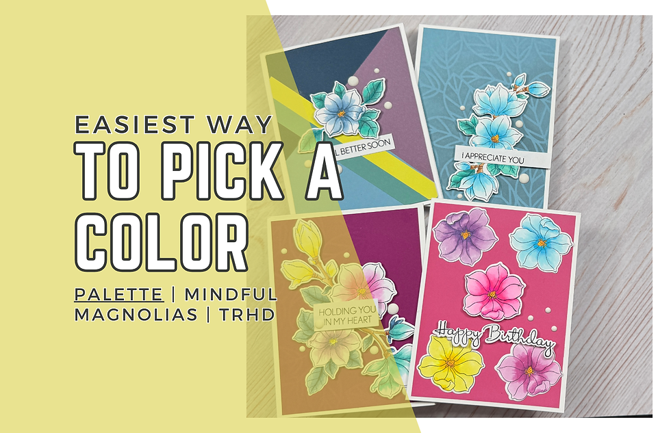
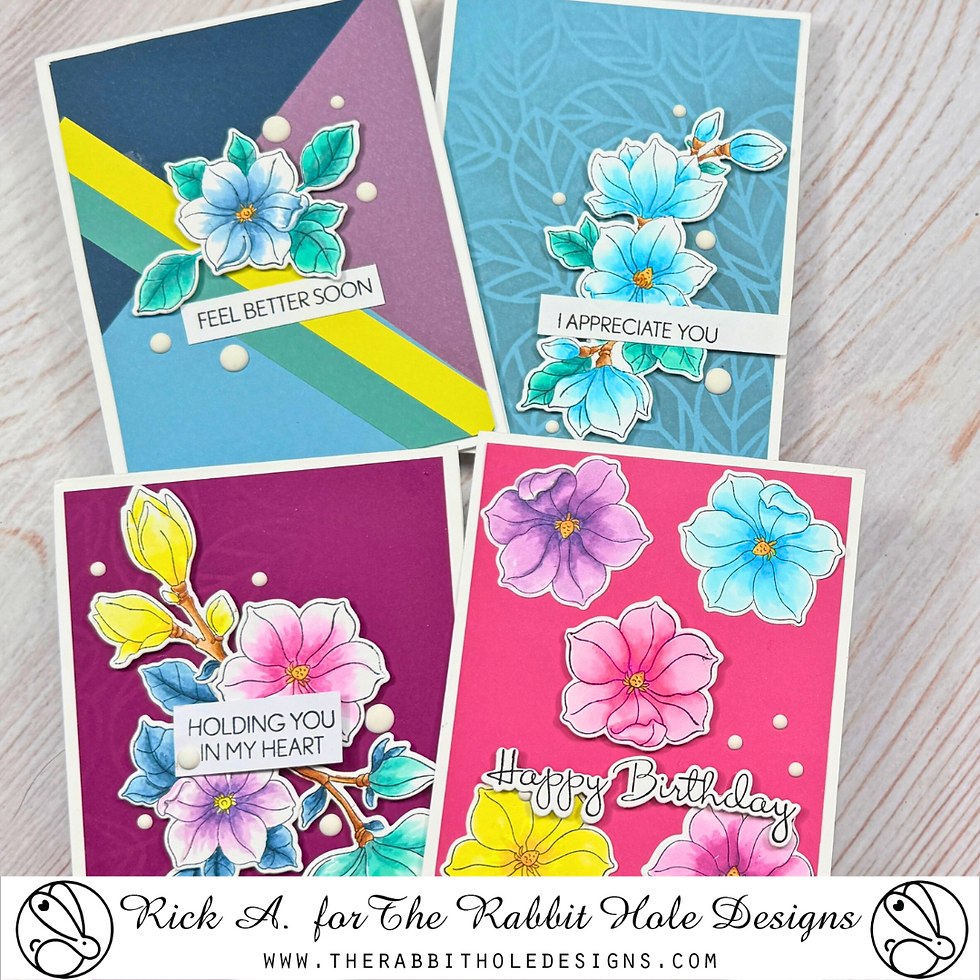
For my projects, I created four different cards featuring the Mindful Magnolia Stamp Set and Mindful Magnolia Dies from The Rabbit Hole Designs. Instead of stressing over what colors to use, I let the Candy Smooth Cardstock Paper Pad do the work for me. This cardstock pad has a beautifully curated set of colors, and I used it as the foundation for my entire color palette.
In my video tutorial (linked below), I’m walking you through how I matched my Copic markers to the cardstock colors, giving you an easy way to create cohesive, professional-looking cards. I also share some color theory tips to help you feel more confident in picking your own palettes. Let’s dive in!
Easiest Way to Pick a Color Palette:
Why Color Matching Makes a Difference
One of the biggest challenges in card making is making sure everything coordinates. You might color an image beautifully, but if it doesn’t match your background or other elements, the card can feel disjointed.
That’s why I love using pre-selected cardstock packs like the Candy Smooth Cardstock Paper Pad. The colors are already designed to work together, so all I have to do is match my markers to the cardstock. This trick makes designing cards so much easier!
Pro Tip: If you’re ever unsure about a color combination, try swatching your markers on a scrap piece of the cardstock before committing to your final design. This way, you can see how well the colors coordinate before you start coloring your stamped images.
Building the Color Palette
For this set of cards, I pulled colors directly from the Candy Smooth Cardstock Paper Pad. Each card features a different combination, but they all stay within the same general color family, which keeps everything looking cohesive.
After stamping all my images from the Mindful Magnolia Stamp Set onto Neenah Classic Crest Solar White 80 lb Cardstock using Memento Tuxedo Black Ink, I used different Copic marker combinations to match the cardstock colors.
Here’s where color theory comes in—keeping a mix of warm and cool tones helps balance the overall look. I also made sure to vary the intensity of colors, using both bold and soft shades to add depth and contrast.
A Closer Look at the Four Cards
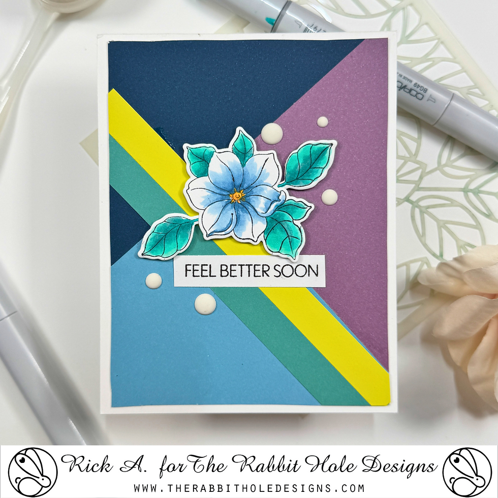
Card 1: Blue & Blue-Green Elegance
For the first card, I stuck with a cool-toned palette of blues and blue-greens, using a pop of golden orange for contrast. I colored the large magnolia swag with these shades and paired it with a dusty blue cardstock panel, ink blended with the Amanda Stencil using soft gray inks.
Gray is a great neutral—it adds depth without competing with the focal image. To finish, I added a sentiment and a few White Matte Enamel Dots for subtle dimension.
Pro Tip: When working with a monochromatic color scheme, adding just a touch of a complementary color (like the golden orange here) makes the design more dynamic and interesting.
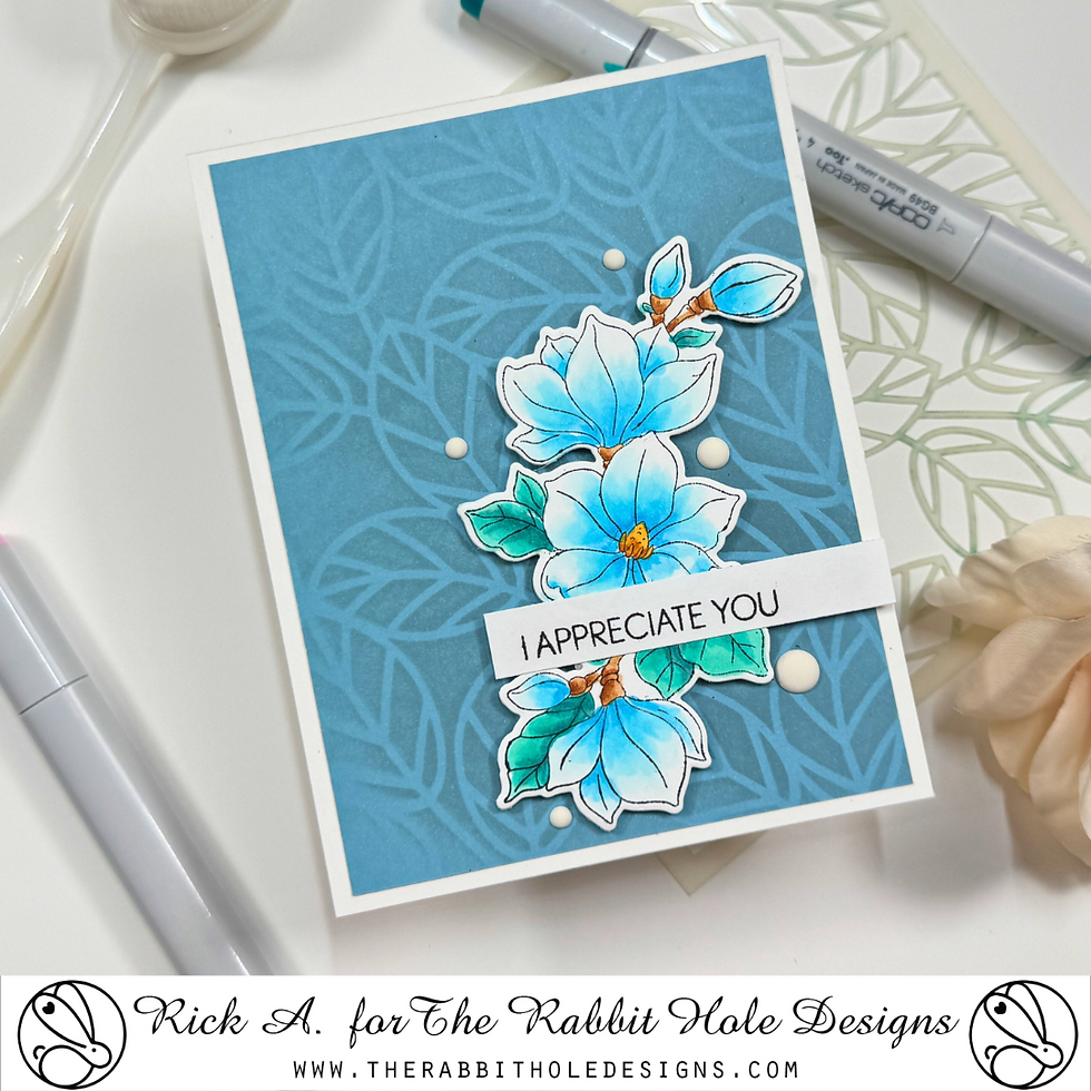
Card 2: A Rainbow Magnolia Mix
For this one, I went with a more playful, colorful approach. I chose a rainbow-inspired color scheme, coloring one of the magnolia stems in yellow, the larger magnolias in blue-green, and the two open flowers in pink and violet.
To complement the vibrant florals, I used a red-violet cardstock panel and stenciled a subtle leaf pattern using gray ink. Gray ink blending is one of my go-to techniques because it tones down the background while still adding texture.

Card 3: A Grid of Colorful Magnolias
I love a clean and structured design, so for this card, I stamped five of the smaller magnolias and colored them each in a different shade—blue, violet, red-violet, yellow, and pink—to showcase a variety of colors from the cardstock pad.
I arranged them in a simple grid on a pink cardstock background, keeping the layout minimal to let the florals shine. A small Happy Birthday sentiment and a few enamel dots were all it needed to complete the design.
Pro Tip: When using multiple colors in a design, keeping the layout simple helps maintain balance and prevents the card from looking too busy.

Card 4: Bold Color-Blocked Background
For my last card, I wanted something modern and striking. I created a color-blocked background using navy, violet, and dusty blue cardstock. To break it up and add even more interest, I added yellow and dusty blue-green cardstock strips across the center.
The final touch was adding a blue magnolia with blue-green leaves, along with a Feel Better Soon sentiment. A scattering of White Matte Enamel Dots finished it off perfectly.
Pro Tip: Color blocking is an easy way to create bold backgrounds without overpowering your focal image. Try mixing contrasting and complementary colors for a high-impact look!
Final Thoughts
Choosing a color palette doesn’t have to be overwhelming. By using a pre-selected cardstock pack as inspiration, you can create a cohesive look effortlessly. Whether you prefer soft monochromatic tones or bold rainbow hues, this technique ensures your colors will always work together beautifully.
I hope this post (and the video tutorial) gives you some inspiration for your next project. If you try out this color-matching trick, let me know—I’d love to see what you create!
Thanks for stopping by, and happy crafting!
Easiest Way to Pick a Color Palette Video Tutorial:
If you have problems seeing the video here on my blog you can watch it on my YouTube channel by Clicking HERE!
Savings Code:
Use the code Rick10 at check out at the Rabbit Hole Designs to save 10% on your order.
Copic Color Combos:
Blue Green Combo - BG13, BG23, BG18, BG49
Blue Color Combo - B000, B01, B02, B04
Dusty Blue Color Combo - B93, B95, B97, B99
Pink Color Combo - RV01, RV04, RV06
Red Violet Combo - RV51, RV42, V05, V06
Violet Combo - V12, V15, V17
Orange Color Combo - Y17, Y38,YR14
Yellow Color Combo - Y02, Y06, Y08
Brown Color Combo - E33, E35, E37, E39
Thanks for dropping by today I hope that you found a little spark of creative inspiration with my project today. Wondering what I used in this project? Everything is linked to multiple sources in the thumbnails in the Materials Used section, or in the text below. Compensated affiliate links used when possible.
Materials Used:
Here you will find the list of supplies that I used to create today's card. All supplies are linked to supply sources below. Compensated affiliate links may be used at no cost to you.
Happy Stampin'

Rick Adkins
Affiliate Disclaimer:
Just a friendly reminder, as part of my commitment to transparency, please note that some of the links provided maybe affiliate links. This means that if you make a purchase through these links, I may earn a small commission at no extra cost to you. Your support is truly appreciated!
Additionally, I kindly ask that you always accept the tracking cookie for the affiliate websites. Rest assured, this will not in any way expose your computer to viruses or compromise your information. It's simply necessary for the company to attribute the sale to the affiliate, ensuring creators like myself receive their rightful commissions.
Your trust and support enable me to continue sharing creativity through my email lists, blog, and YouTube channel. Thank you for being a valued part of our crafting community!
Comments